Every Pixel Perfect Review: FF DOT. – The Pixel Art of Final Fantasy –

Standard

Kazuko Shibuya is one of the most influential artists in game design and an unsung hero of the ‘videogame’ aesthetic. She created and refined many of the visual elements that have come to define the look of JRPGs . Her artwork for Final Fantasy on the Famicom captured the perfect proportions for expressive and detailed, but uncluttered character design. The default character sprites for the Warriors of Light are timeless and continue to be riffed upon, referenced, parodied, and pastiched in and outside of videogames. Much like coins or ‘? Blocks’ or a HI SCORE leaderboard, Shibuya’s 16×24 pixel figures are cultural shorthand for not just adventure games of a certain vintage, but videogames as the world sees them.

It’s fitting then that for the 30th anniversary of Final Fantasy, Square Enix has released a 288-page love letter to Shibuya, the pixel artists of the 8- and 16-bit era of Final Fantasy, and to an art style that continues to shape pop culture.

FFDOTCovr

FF DOT. is absolutely a book that you can judge by it’s cover – minimalist, deliberate, clean, and a little bit whimsical. The content is exactly what you would expect. Blown up pixel art from Final Fantasy I, II, III, IV, V, and VI in chronological order with plain, often white or black, backgrounds to better highlight the sharp edges and bright colours of the art.

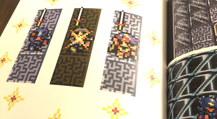
The NES/Famicom trilogy gets the most even representation across it’s three titles. Each section starts out with a detailed look at the playable characters sprites, often breaking down select sprites with both a grid to show the exact dimensions and a colour palette to show just how limited a colour range the artist had to work within. The character section for Final Fantasy III is predictably robust – being the first game in the series to have a job-change system a lot of real estate is taken up by showing off the dozens of different sprites created for each class. Having these character sprites from these three titles in such close proximity makes for a really interesting look at what changes were made to each class as the series progressed; I had never appreciated the subtle differences between Warrior(FFI), Firion(FFII), and Warrior(FFIII) until I compared their dedicated pages in FF DOT.

IMG_4687.JPG

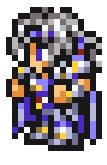
WARNING: Book contains a lot of guys that look like this.

But Final Fantasy is more than just the Warriors of Light. Each game also has pages dedicated to enemy sprites, battle backgrounds, items, towns (often breaking them down tile by tile), menus, and bosses. The layout does an excellent job at emphasizing key battle sequences by featuring certain bosses in two-page spreads, sometimes with key dialogue helpfully presented in both Japanese and English. In fact an interesting thing to note is that while this is a Japanese import book, all text is presented not only in Japanese and English, but localized names are provided alongside the Romanized Japanese originals. It’s a nice touch that shows this book was made with love and care for an international audience. It’s also a startling reminder that while Sabin is a bit of a goofy name, it’s infinitely more believable than Mash.

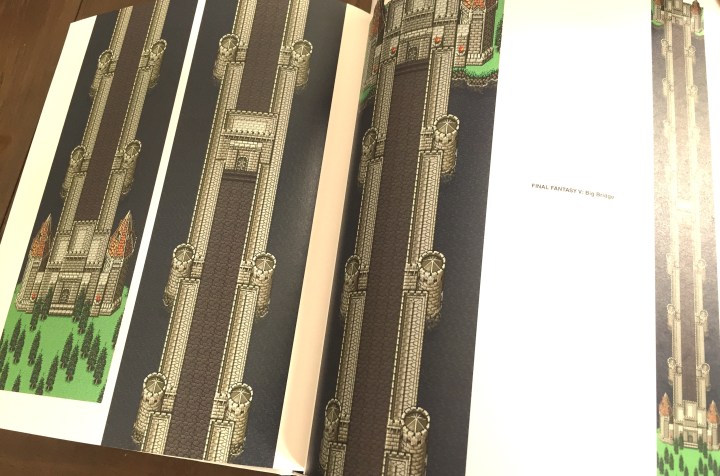
Speaking of Final Fantasy VI, the SNES/Super Famicom era is where FF DOT. falls on it’s face a little. Let’s talk first about where it succeeds. First of all the quality of the art itself is incredible. Any Final Fantasy fan can tell you that, sure, but to see the Phantom Train, Neo Exdeath, and the Four Fiends given the full page treatment really shows of the skill and artistry that went into these games. Two pages are given to the opera scene; one page shows the perspective from the audience, while the other shows the view from onstage as well as Celes throwing her bouquet from atop the set. These story moments captured in time are where the 16-bit trilogy section truly excels.

IMG_4689.JPG

I love this layout so much. Someone had to sign off on this. This is brilliant.

Unfortunately the same care that went into meticulously presenting the character sprites of the 8-bit era seems to have been thrown out the window a bit for the 16-bit titles. Final Fantasy V, being the job-based game of this era, is the exception and ends up being represented exceptionally well. All five main characters get full spreads with all of their job-classes present (sans the jobs introduced in the GBA version). Much like the evolution of job design in the NES/Famicom games, comparing the minor differences in the way each FFV character interprets traditional jobs is a real treat – Bartz’ adherence to classic Final Fantasy style, Faris’ balance between masculine and feminine, and Krile’s upending of convention for the sake of cuteness. The casts of Final Fantasy IV and Final Fantasy VI however don’t get the same level of attention.

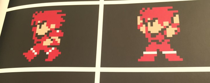
Throughout FF DOT. each major character is given a new idle sprite created by Kazuko Shibuya to reflect the evolution of her art. These new pieces are called the ‘2018 Version’ and they show up in each game’s character section to sort of show off what Shibuya’s interpretation of these characters might be today. They are a wonderful addition and wonderful way to show Shibuya’s passion for the series and the characters she helped to create. For whatever reason the character sections of Final Fantasy IV and Final Fantasy VI only show these 2018 reinterpretations. Some of the original sprites for these characters can be seen on other pages as parts of larger scenes but not all of them and often not in their standard idle battle pose. Relm, Strago, Rydia and Rosa are just a few examples of characters whose original battle sprites are nowhere to be seen. It’s a baffling decision especially considering I, II, III, and V all have sections dedicated to this very thing. An odd choice and the only thing that mars an otherwise brilliant collection of artwork. Luckily there are a couple extra sections that help make up for this oversight and really push FF DOT. into must-have territory.

The ‘2018 version’ treatment isn’t just limited to the two Nintendo trilogies – every main title in the series up to Final Fantasy XV gets a pixel art makeover. While this isn’t the first time all of these characters have been reinterpreted this way (Final Fantasy XV has pixel art versions of the main four cast members in-game, and Final Fantasy Record Keeper is a mobile game solely about presenting Final Fantasy characters from across the series in a retro style), it is the first time that Kazuko Shibuya has rendered many of them herself. Some entries in the series get more love than others (Kiros and Ward, really?) and there are some important characters left out of the action (XIV doesn’t have any representation beyond A Realm Reborn and even then, no Merlwyb!) but it makes for a fun look at an alternate dimension where the series never left the Super Nintendo. Ever.

IMG_4690.JPG

Things have uh… changed for the cast of XIV since then.

And the finale of FF DOT. is almost worth price of admission itself; a ten-page interview with Kazuko Shibuya herself. Accompanied by black and white photos of her and her workspace, it’s a charming and insightful interview that I implore people read if they have any interest in the early days of Square and pioneer women of the games industry. It’s the perfect way to end such a great tribute to her work and the work of everyone who helped make the iconic visuals of such a ubiquitous franchise.

FF DOT. is the kind of book that I wish there were more of. Publishers like Dark Horse and Udon do a great job of localizing beautiful artbooks for all kinds of games with amazing illustrations and they deserve tons of credit for doing so, but these books are often physically large and dense with the same kinds of content. They are ultimately treated like any other merch that lines the shelves of comic shops and Gamestops for a fan to put on their bookshelf with a dozen other books just like it. FF DOT. takes a decidedly different approach to appreciating videogame art; it curates and recontextualizes in-game assets to create a compelling and well-paced journey through a revolutionary movement of digital art.

I highly recommend FF DOT. for anyone with an interest in pixel art, the history of Final Fantasy, and granular visual studies of videogame art and aesthetic.

FF DOT. is available now on the Square Enix official online store for $43.99 USD + shipping, Amazon.com for $52.99 + shipping, or from Amazon.co.jp for 3,780 JPY + shipping. Amazon Japan worked out to be the best price for me.

IMG_4688.JPG

Every Pixel Perfect 001 – The Evolution of Cecil

Standard

The evolution of dot/pixel/sprite art in the Final Fantasy series is a topic that I plan on returning to plenty of times throughout this series – there’s 30 years worth of material there to work with after all. Particularly relevant to my interest is the work of artist Kazuko Shibuya. She’s been with Square since the very beginning and is responsible for such designs as the iconic job sprites from Final Fantasy I as well as the enemy sprites she transposed from Yoshitaka Amano’s original concept art. She’s one of Square’s unsung heroes and continues to oversee art and design elements for Final Fantasy to this day.

Cecil_Paladin

I’ve decided to start my analysis of the evolution of Final Fantasy sprite art with everyone’s favourite good boy, Final Fantasy IV’s Cecil Harvey. Since 1991 Cecil has appeared in spin-offs, sequels, remakes, ports, mobile games, etc., and continues to be the poster-boy for the paladin job class. Though Cecil’s original in-game sprite wasn’t designed by Shibuya herself, she did create the artwork that inspired it. You may recognize the trademark chibi style from the covers of the Japanese version of the game:

ShibuyaCecil

From this illustration came the in-game battle sprite for Cecil that everyone knows and loves. Unfortunately I haven’t been able to pin down exactly who on the FFIV team made this sprite; the titles of the staff members in the credits are vague. Even Shibuya was only mentioned in the SPECIAL THANKS category. The best bets for the original artist are Hiromi Nakada, Ryoko Tanaka, (both listed under MAIN GRAPHIC) or Tetsuya Takahashi (with the equally vague title of BATTLE GRAPHIC). Masanori Hoshino is also listed under BATTLE GRAPHIC but when he is encountered as an easter egg in the Developer’s Room he asks the party if the monster designs were to their liking. That doesn’t mean he couldn’t have had a hand in designing the characters, but at the very least his focus was enemy design. Curiously, even recent entries like Record Keeper haven’t gotten much better at making their credits known.

With that in mind let’s take a look at how Cecil has changed through the years.

CecilThroughtheAges

(A)
Final Fantasy IV – SNES – 1991

Here’s the OG. After shedding his Dark Knight armour Cecil becomes the first Final Fantasy character to take on the job title of Paladin. Here we see the debut of elements that would become synonymous with the job throughout the series: the suit of knightly armour, the saintly diadem. Cecil looks virtually nothing like his Amano concept art but is still distinct and colorful. Of particular note is how the sprite stands; legs and face in side profile, but with the chest in a ¾ view where both shoulders can be seen. Though Shibuya herself didn’t create these first 16-bit battle sprites, this stance with the single visible leg, distinct from Final Fantasy VI’s full ¾ view, would influence her style later on, particularly in 2008 with her work on The After Years following a ten-year hiatus. Also of note is that much like Link in A Link to the Past, Cecil’s hair colour is a radical departure from any of his other appearances. Those crazy 90s kids.

CECILPS1
(B)
Final Fantasy Chronicles – PS1 – 2001

Cecil and several other characters were given re-drawn sprites during the loading screens of the PS1 port included in the Final Fantasy Chronicles compilation. It’s the only time these specific sprites make an appearance and they feature some unique poses like Cecil running, Kain holding his lance, and Rosa kneeling in prayer. It’s only marginally different from the SNES original on the surface, but the subtle changes are interesting. Notably it’s the only sprite that softens the outline of the character’s features – the face, hair, body, and hands are still distinct but with more subtle shading than the cartoony black outline of in-game battle sprite. With all the tiny differences in shape and outline I can’t help but think that perhaps the artist whose job it was to redraw these sprites didn’t have any reference to work from other than looking at the game on a CRT screen. They may have adapted it as closely as they reasonable could without a pixel-by-pixel example and understandably created some discrepancies. You end up with a sprite that for all intents and purposes would have looked the same on a blurry 90s television. That’s just my theory though.

CECILRK1
(C)
Final Fantasy Record Keeper – Mobile – 2014

I’m jumping a bit in the chronology with this one but I think it’s fun to look at next to the SNES original. Final Fantasy Record Keeper is a free-to-play mobile game that has survived almost purely on the novelty of seeing characters old and new in the 16-bit style. To the average player it may seem that the sprites were ripped directly from the original but side-by-side you can see a distinct difference. Record Keeper’s sprites actually crib their style from Final Fantasy VI – note that the face is still in profile, but both the chest AND the legs are in ¾ view. This was standard for Terra and friends but they were the exception in a series that refused to show us anyone’s upstage leg. This sprite economizes space a little better as well; Cecil’s face is one less pixel tall and wide. This gives more freedom to detail things like the hair and pauldrons. His left and right fist use three pixels and one pixel fewer respectively. This may not sound like much on paper but when you’re working with a 16×24 canvas it can make a world of difference. All the visual information of the original is still conveyed here but in a more efficient way. Seeing the upstage leg doesn’t just help the viewer get a better sense of depth by matching the perspective of his torso, but it helps Cecil appear balanced – the original’s slightly larger head and fists make him appear top heavy and pitched forward.

This style that embraces a ¾ chest and leg view only appeared in the main series for Final Fantasy VI and wouldn’t see a return until All The Bravest and Record Keeper used it from 2013 onward.

CECILAY
(D)
Final Fantasy IV The After Years – Mobile – 2008

Before Square discovered the gacha model could be used to milk nostalgia for all it’s worth, Final Fantasy came to mobile phones in the much-maligned FFIV sequel, The After Years. This was Shibuya’s first pixel art in ten years after working on UI and other graphic design elements for the series. This Cecil is thirteen years older than in FFIV and bears little resemblance to his younger self. What’s interesting here is again the stance he’s in. Shibuya returns to the simpler body shape of the single-leg view with the ¾ chest. Remember that FFVI had expanded on this over a decade earlier and was praised endlessly for being the zenith of pixel art for the time. It could be argued that this was done to preserve the look and feel of IV’s style but I’m not convinced. Just look at the drastic difference in proportions between The After Years and FFIV — nearly half the pixels that were used for SNES Cecil’s face are used here, the shoulders are dropped to give the figure a more human silhouette, the arms are extended further and at different lengths, and the hands are smaller. It seems less like an insistence on a return to the SNES style and more Shibuya finding a style that appealed to her the most, consciously disregarding the changes that had been made for VI.
This is also the first time we see Cecil’s headwear represented as it is in his concept art – a single blue pixel gives us all the visual information we need to infer his kingly circlet. Another version of this sprite exists on the cover of the album FINAL FANTASY TRIBUTE ~THANKS~ from 2012 with a few single-pixel alterations and a decidedly more angry facial expression. Shibuya herself drew all the sprites for the cover and there’s an incredible interview with her around the time of the album’s release at shmuplations.

CECILCALENDAR
(E)
FF DOT. CALENDAR 2018 – 2018

A little out of chronological order again but this one is interesting to look at next to After Years Cecil. This sprite was created by Shibuya for a 2018 pixel art calendar sold on Square Enix’s Japanese online store and is the most recent interpretation of the character. Because no bitmap of this sprite is available I created one myself using images of the calendar as a reference.

Here Cecil is depicted as his younger self and more closely resembles his concept art than ever before. The yellow lining of his cape, the pauldron spikes, and his purple circlet show us the essence of Amano’s paladin. It also bears the distinction of being the angriest Cecil of the bunch. In fact many of Shibuya’s recent work has depicted a large number of Final Fantasy protagonists with the American Kirby angry eyes. Maybe she’s going through something.

CECILRK2
(F)
Final Fantasy Record Keeper – Mobile – 2014

The “Cosmic Paladin” costume from Record Keeper is meant to depict Cecil as he was seen in Dissidia which in turn was meant to evoke the feeling of Amano’s original concept art. Like Shibuya’s calendar piece this Cecil tries to portray his white flowing tresses, his purple and ivory palette, and the intricacies of his armour. Unfortunately it tries to be a bit too literal with some of the representation and winds up being a bit muddy. Without prior knowledge of Cecil’s Dissidia outfit there’s just not enough space in the 16×24 pixel canvas to translate the design this literally. It was ambitious though and I’m glad this little piece exists.

CECILPICT
(G)
Pictlogica Final Fantasy – Mobile – 2013

I admit that the Pictlogica design for Cecil was not my favourite at first, but I’ve warmed up to the slightly vacant expression and less intricate colours. Despite having a similar palette it’s hard to find anything distinctly ‘Cecil’ about this sprite. The elements are there but he feels the most generic of the bunch.

Comparing the in-house styles of Pictlogica and Record Keeper is one of my favourite things when it comes to Final Fantasy sprite work. Both are mobile games that feature constantly updating rosters of Final Fantasy characters old and new, but that’s where their design similarities end. Where Record Keeper’s sprites carry on the visual elements of Final Fantasy VI, Pictlogica seems to be doing it’s own thing entirely, for better or worse. It still gives us the upstage leg for added depth but it also opts for much simpler colour palettes and bolder outlines. Lighter colours are used to give the black outlines a higher contrast than the more visually complex Record Keeper sprites. Go search for your favourite Final Fantasy protagonist from both games and you’ll see just how differently their design can be interpreted. It’s especially interesting for characters from IV and V; comparing the originals, their VI-inspired Record Keeper counterparts, and their Pictlogica versions is an interesting study.

The fact that Shibuya didn’t create a sprite based on his concept art until 2017 shows that the skill required to interpret Amano’s art into such minimal real estate is an incredibly difficult undertaking. That’s almost certainly one of the reasons that so many liberties were taken when he first appeared in 16-bits with his short purple hair and golden armour.

It can be easy to take excellent pixel art for granted when game stores are lousy with throwback merchandise and each week sees a new retro-inspired platformer. With Final Fantasy having recently celebrated it’s 30th birthday there are plenty of avenues for Square to capitalize on series nostalgia. But even taken out of context it’s easy to see what makes these designs so evergreen. It’s the limitation of resources that forces an artist to make bold choices about how visual information is presented. This isn’t a new idea to anyone familiar with pixel art, but to see how many different artists (or even the same artist over many years) can interpret a character using the same limitations is endlessly exciting. And Cecil, as the white knight that introduced RPGs to a significant audience in the west, is a perfect example of how varied these interpretations can be.

Timed Hits List Review: SQUARE ENIX JAZZ -FINAL FANTASY-

Standard

The world of Final Fantasy arrange albums is as complex as the franchise itself; replete with nearly as many masterpieces-that-shouldn’t-be-missed as there are one-offs-that-you-could-probably-live-a-satisfying-life-never-experiencing. It’s not unreasonable for someone to see the dozens upon dozens of albums released in the past 20+ years and be intimidated enough to leave the whole darn thing alone. But for fans of Final Fantasy, fans of the music of Nobuo Uematsu and his successors, and those who are interested in videogame-adjacent music, there’s a lot to love if you’re willing to take the dive.

There’s no doubt that I’ll be covering many of these albums throughout the years but the first on the list is the most recent;

SQUARE ENIX JAZZ –FINAL FANTASY—

Released: November-22-2017

World-renowned jazz musicians, Eijiro Nakagawa and Ryu Kawamura have taken well-known tracks from nearly every game in the main series (sorry, fans of VII, XI, and XII) and infused them with the horns, swung rhythms, and improvised solos that make jazz what it is. But ‘jazz’ is a broad term and just slapping it onto some of the most memorable tunes in videogame history doesn’t necessarily mean instant success.

jacket.png

Before we even dive into this music I have a bone to pick. The history of jazz album art is as nuanced and beautiful as the music itself. It’s a history of high-contrast photography, energetic shapes and colours, high-impact fonts – it is mid-century graphic design at it’s absolute best. Maybe it’s too much to ask but SQUARE ENIX JAZZ –FINAL FANTASY- has easily one of the dorkiest covers I’ve seen in a long time, regardless of genre. Nothing to hang on the wall, that’s for sure. It’s too bad because Square has produced some excellent, if conceptually abstract, album art over the years. The cover features Vivi playing a saxophone over a blue background with the album title in a decidedly unattractive font in the top let corner. It’s criminally uninteresting. Nothing about this cover lets the listener know what they’re in for beyond the idea that Final Fantasy and ‘jazz’ are involved. It doesn’t take too long to discover that this lack of specificity and direction encompasses the style of (or lack thereof) jazz we’re about to experience.

The music starts off with a bang. A high energy, latin-infused rendition of Final Fantasy XIII’s “Blinded By Light” kicks things off and sets the stage for what we can expect from a lot of the tracks on this album; technically fantastic solo sections book-ended by well-trodden melodies. “Eternal Wind” from Final Fantasy III heads toward the more relaxed end of the spectrum but the instruments used give it an unfortunately “spa-waiting room” feel that rears it’s ugly head several times throughout the album. It’s unfortunate because “Eternal Wind” is one of my favourite songs in the series and I always look forward to a new arrangement of anything from FFIII. Luckily the melody is as infectious as ever and the drums and piano add interesting texture in the latter portions.

“Searching for Friends” from the tragically underappreciated Final Fantasy V falls into a similar trap as “Eternal Wind”; it’s a competent enough piece with excellent solos but the instruments chosen and the lack of contrast throughout the piece keeps it in the realm of background music. Final Fantasy IV’s famous “Battle With the Four Fiends” is the first track that feels at home. The bass is featured more prominently and the guitar takes a backseat to the tight shots from the horns. Everything backs off during the solos and gives the whole piece room to breathe, which is important when you’re fighting Golbez’s four best. Despite being a stressful song to listen to because of the memories tied to these moments in-game, this feels like one of the most fully realized pieces of music on the album.

Probably the most recognizable melody from Final Fantasy II, “The Rebel Army” takes the jazzier ideas from Four Fiends and runs with them; this tune gets swung to hell — where it kills the ruler of that fell place and returns even more powerful than before. Just bass, horns, piano, drums and backphrasing that won’t quit, this is one of the few tracks that would sit comfortable on anyone’s regular jazz playlist. It’s a genuine treat.

Kawamura’s call-and-response thru-line in Final Fantasy V’s “Clash on the Big Bridge” makes it a standout. This song goes plenty of fun places, none of which are expected from this boss fight theme. It builds to a fantastic battle between the piano and the sounds of the Super Famicom that culminates in Gilgamesh “running away” at the end. It suits the theme song for Final Fantasy’s most loveable villain.

“Serah’s Theme” from XIII is by far the most relaxing piece of the album and serves as an excellent intermission. Just some excellent jazz piano, a few bars of featured bass, the drums having a hell of a time, and one of Masashi Hamauzu’s finest melodies. This is another highlight that is bound to satisfy even those unfamiliar with Final Fantasy. X’s Zanarkand is a bona fide earworm. It seems a tad out of place with it’s Spanish guitar and oboe but it’s nice enough on it’s own.

The first of the back-to-back Final Fantasy IX tracks is the completely bonkers “Not Alone”. The original sounded very much like something you’d hear from a busker at the quay. This arrangement pays homage to that sound briefly and then proceeds to go all over the place. It brings in some New Orleans sound but drops it too soon. This song captures the feeling of the album almost perfectly: a lot of different components indicative of jazz that get abandoned too quickly to contribute to a theme. “Melodies of Life” is a lovely version of IX’s ending theme but it feels completely out of place. It’s a lovely ballad that unfortunately only adds to the confusion of what this album was trying to achieve. Certainly worth listening to if you’re a fan of that piece, but sticks out like a sore thumb.

“Love Grows” from Final Fantasy VIII is a sitcom theme song with a solo section. And it’s kind of great. Just imagining the cast of FFVIII in front of a studio audience is enough to sell this song for me. I don’t even care.

The album concludes with the tried and true “Final Fantasy Main Theme”. The wonderful solos are bookended by a guitar line that feels like a slap in the face. Though I suppose without a real theme for this album why NOT throw a rock ballad in at the end?

If the album’s goal was to create a Final Fantasy tribute that featured elements of jazz then I suppose it succeeded. Unfortunately it feels far too often like ‘jazz’ just happened to be a common denominator as opposed to the ethos of the arrangement process. Very rarely does this album explore interesting territory and when it does you’re bound to get a jarring return to “waiting room” jazz far too soon. Still, the handful of excellent tracks are worth listening to regardless of your familiarity with the source material. A lack of a cohesive thesis is what keeps the album as a whole from rising above it’s novelty.

Final Fantasy Dimensions II Might Not Be Just Another Mobile FF (UPDATED)

Standard

UPDATE: All of this was wrong. Final Fantasy Legends II ended up being a rebranding of the pre-existing free-to-play mobile game Final Fantasy Legends: Toki no Suisho. I was so very wrong and there’s little to no hope of a game like Final Fantasy Dimensions ever again and life is hard sometimes.

The past few years have seen a bumper crop of Final Fantasy titles for phones. I don’t envy anyone wading through their respective online store and trying to suss out exactly what any of these games are. Tell you what; I’m going to search ‘Final Fantasy’ in the app store right now and report back what I find:

FINAL FANTASY BRAVE EXVIUS
FINAL FANTASY
FINAL FANTASY 6+1-in-one
MOBIUS FINAL FANTASY
FINAL FANTASY DIMENSIONS
FINAL FANTASY Record Keeper
FINAL FANTASY ALL THE BRAVEST
FINAL FANTASY VI
FINAL FANTASY IV
FINAL FANTASY IV Complete Pack
FINAL FANTASY PORTAL APP
FINAL FANTASY TACTICS: THE WAR OF THE LIONS
FINAL FANTASY III
THEATRHYTHM FINAL FANTASY
FINAL FANTASY II
FINAL FANTASY V
FINAL FANTASY VII
FINAL FANTASY IX
FINAL FANTASY IV: THE AFTER YEARS
FINAL FANTASY XIV: LIBRA EORZEA
PICTLOGICA FINAL FANTASY

And that’s just the titles that contain the words ‘Final Fantasy’ in them – Kingdom Hearts and Justice Monsters Five are a whole other can of worms.

Side Bar: Reading through that list, it actually took me a moment to realize that FINAL FANTASY 6+1-in-one isn’t a Square Enix Wacky Name™; it’s a bundle of 6 games but then also another game. Here in Canada we call that 7 but what do I know?

Anyway, that list is a mess of numerals, subtitles, words that aren’t real, and combinations of numerals and words that aren’t real. I don’t blame anyone who would rather swear off the experience of trying to find the right Final Fantasy for them entirely. But this list is as varied as it is confusing. Certainly there are cynical cash-grabs like All The Bravest and severely compromised ports of classics like V and VI. But there’s also a handful of really interesting experiments that show off how to make a rewarding free-to-play experience: Record Keeper focuses on customizing dozens upon dozens of classic FF characters and engaging exclusively in combat, Brave Exvius adds in map exploration and other traditional RPG elements, and Mobius takes the production value to an entirely new level.

Ugly ports and free-to-play games aren’t for everyone though. Luckily there exists a charming little oasis from it all in the form of Final Fantasy Dimensions. Originally named Final Fantasy Legends in Japan, Dimensions was rebranded to prevent confusion between it and the 1989 Game Boy title ‘The Final Fantasy Legend’ which was actually part of the SaGa series in Japanese. Names are hard.

Dimensions was a passion project by then head of mobile development Takashi Tokita, one of the driving forces behind Chrono Trigger, Final Fantasy IV and my personal favourite, Live-A-Live. Dimensions represented his refusal to let micro-transactions become the only path forward for Square on mobile; it is a standalone game that doesn’t require an online connection, and it’s only in-app-purchases are the chapters of the game itself and an optional chiptune soundtrack. You won’t find any gacha-style mechanics marring this beauty.

Final_fantasy_dimensions_legends_multiple_jobs.png

Artist for the FFIV novelization and The After Years, Akira Oguro returned for Dimensions

The game itself isn’t the best 2D Final Fantasy in the world. It’s light on side-quest and content outside the main story, the touchscreen controls are a typical pain, the localization has a few too many ‘lol meme’ moments that wouldn’t be missed if they were sent to a farm upstate, and it is a linear affair given the episodic structure. That said, the job system from V makes a triumphant return with plenty of tweaks that make things feel fresh, the soundtrack is full of great work by series-regular Naoshi Mizuta, and the story is charming and full of interesting characters. And it’s a full-on 2D Final Fantasy. That alone is a novel enough concept in this era of gaming to give it a fair shake.

ff_dimensions_alba__dusk_world_of_nil

It has that unfortunate ‘RPG Maker’ look that mobile FFs have, but there’s a gem under there

Astoundingly, Tokita announced this morning that a full-fledged sequel to Dimensions is on the horizon. Outside of the requisite Yoshitaka Amano art, little is known about the game, however, Tokita has mentioned that the title will be a ‘rebirth’ and a true sequel to Final Fantasy Dimensions. This might sound redundant to call a game with a ‘II’ in its title a true sequel, but he’s likely referring to Final Fantasy Legends: Toki no Suisho – a Japan-only mobile game also directed by Tokita that featured the usual mobile game trappings of stamina bars and luck-based item draws.

amanodii

Hopefully that clock doesn’t represent a stamina timer

It’s not difficult to read between the lines and infer that Tokita is making a second attempt at crafting a traditional Final Fantasy experience. I could be completely off-base of course, but the language he’s used so far suggests that he’s returning to the structure and spirit of the original Dimensions.

Unfortunately, despite his attempts to assuage people’s fears of the ‘mobile Final Fantasy’, it seems like people online are quick to write off the announcement of Dimensions II. Just take a look at some of the comments and headlines that have cropped up before any information on the game has been revealed:

“Chrono Trigger Director Working on New Final Fantasy… For Mobile”

“I refuse to use, buy or play any mobile thing made by this company.”

“Your headline had me so excited then I saw mobile.”

“Not sure why…but this being a mobile game makes me feel like it’s not worth my time.”

It’s easy to see that there’s a disconnect between Tokita’s vision for games like Dimensions II, the chosen platform, and the perception of mobile games by Final Fantasy fans. Even comments on the mobile-friendly site Touch Arcade are overwhelmingly negative and already assume that the game will be a F2P social game.

My hope is for people to give games like the original Dimensions a fair shake despite being on a platform associated with micro-transactions and luck-based pulls. It isn’t that kind of game. It might not be a perfect 2D Final Fantasy game, but showing support for it, for Tokita, for games that buck monetization trends, means studios will see that there is a place for games like this. Mind you, maybe there isn’t. Maybe the 2D JRPG is destined to be unprofitable for big publishers. Maybe indie studios are the only ones who can afford to put their resources into projects like this. But I’m not convinced that people like Tokita and their visions can’t co-exist somewhere between the AAA behemoths like FFXV and the F2P money-makers like Brave Exvius and Record Keeper.

Hopefully Final Fantasy Dimensions II will build upon the high points of Dimensions and offer a full-fledged classic Final Fantasy experience. We just need to not let cynicism towards the mobile market distract us from the unique experiences that are worth checking out. Do it for Tokita.

barbara_sky

Dimensions had a female Dragoon named Barbara and you didn’t even play it, you monster.