The evolution of dot/pixel/sprite art in the Final Fantasy series is a topic that I plan on returning to plenty of times throughout this series – there’s 30 years worth of material there to work with after all. Particularly relevant to my interest is the work of artist Kazuko Shibuya. She’s been with Square since the very beginning and is responsible for such designs as the iconic job sprites from Final Fantasy I as well as the enemy sprites she transposed from Yoshitaka Amano’s original concept art. She’s one of Square’s unsung heroes and continues to oversee art and design elements for Final Fantasy to this day.

I’ve decided to start my analysis of the evolution of Final Fantasy sprite art with everyone’s favourite good boy, Final Fantasy IV’s Cecil Harvey. Since 1991 Cecil has appeared in spin-offs, sequels, remakes, ports, mobile games, etc., and continues to be the poster-boy for the paladin job class. Though Cecil’s original in-game sprite wasn’t designed by Shibuya herself, she did create the artwork that inspired it. You may recognize the trademark chibi style from the covers of the Japanese version of the game:

From this illustration came the in-game battle sprite for Cecil that everyone knows and loves. Unfortunately I haven’t been able to pin down exactly who on the FFIV team made this sprite; the titles of the staff members in the credits are vague. Even Shibuya was only mentioned in the SPECIAL THANKS category. The best bets for the original artist are Hiromi Nakada, Ryoko Tanaka, (both listed under MAIN GRAPHIC) or Tetsuya Takahashi (with the equally vague title of BATTLE GRAPHIC). Masanori Hoshino is also listed under BATTLE GRAPHIC but when he is encountered as an easter egg in the Developer’s Room he asks the party if the monster designs were to their liking. That doesn’t mean he couldn’t have had a hand in designing the characters, but at the very least his focus was enemy design. Curiously, even recent entries like Record Keeper haven’t gotten much better at making their credits known.
With that in mind let’s take a look at how Cecil has changed through the years.

(A)
Final Fantasy IV – SNES – 1991
Here’s the OG. After shedding his Dark Knight armour Cecil becomes the first Final Fantasy character to take on the job title of Paladin. Here we see the debut of elements that would become synonymous with the job throughout the series: the suit of knightly armour, the saintly diadem. Cecil looks virtually nothing like his Amano concept art but is still distinct and colorful. Of particular note is how the sprite stands; legs and face in side profile, but with the chest in a ¾ view where both shoulders can be seen. Though Shibuya herself didn’t create these first 16-bit battle sprites, this stance with the single visible leg, distinct from Final Fantasy VI’s full ¾ view, would influence her style later on, particularly in 2008 with her work on The After Years following a ten-year hiatus. Also of note is that much like Link in A Link to the Past, Cecil’s hair colour is a radical departure from any of his other appearances. Those crazy 90s kids.

(B)
Final Fantasy Chronicles – PS1 – 2001
Cecil and several other characters were given re-drawn sprites during the loading screens of the PS1 port included in the Final Fantasy Chronicles compilation. It’s the only time these specific sprites make an appearance and they feature some unique poses like Cecil running, Kain holding his lance, and Rosa kneeling in prayer. It’s only marginally different from the SNES original on the surface, but the subtle changes are interesting. Notably it’s the only sprite that softens the outline of the character’s features – the face, hair, body, and hands are still distinct but with more subtle shading than the cartoony black outline of in-game battle sprite. With all the tiny differences in shape and outline I can’t help but think that perhaps the artist whose job it was to redraw these sprites didn’t have any reference to work from other than looking at the game on a CRT screen. They may have adapted it as closely as they reasonable could without a pixel-by-pixel example and understandably created some discrepancies. You end up with a sprite that for all intents and purposes would have looked the same on a blurry 90s television. That’s just my theory though.

(C)
Final Fantasy Record Keeper – Mobile – 2014
I’m jumping a bit in the chronology with this one but I think it’s fun to look at next to the SNES original. Final Fantasy Record Keeper is a free-to-play mobile game that has survived almost purely on the novelty of seeing characters old and new in the 16-bit style. To the average player it may seem that the sprites were ripped directly from the original but side-by-side you can see a distinct difference. Record Keeper’s sprites actually crib their style from Final Fantasy VI – note that the face is still in profile, but both the chest AND the legs are in ¾ view. This was standard for Terra and friends but they were the exception in a series that refused to show us anyone’s upstage leg. This sprite economizes space a little better as well; Cecil’s face is one less pixel tall and wide. This gives more freedom to detail things like the hair and pauldrons. His left and right fist use three pixels and one pixel fewer respectively. This may not sound like much on paper but when you’re working with a 16×24 canvas it can make a world of difference. All the visual information of the original is still conveyed here but in a more efficient way. Seeing the upstage leg doesn’t just help the viewer get a better sense of depth by matching the perspective of his torso, but it helps Cecil appear balanced – the original’s slightly larger head and fists make him appear top heavy and pitched forward.
This style that embraces a ¾ chest and leg view only appeared in the main series for Final Fantasy VI and wouldn’t see a return until All The Bravest and Record Keeper used it from 2013 onward.

(D)
Final Fantasy IV The After Years – Mobile – 2008
Before Square discovered the gacha model could be used to milk nostalgia for all it’s worth, Final Fantasy came to mobile phones in the much-maligned FFIV sequel, The After Years. This was Shibuya’s first pixel art in ten years after working on UI and other graphic design elements for the series. This Cecil is thirteen years older than in FFIV and bears little resemblance to his younger self. What’s interesting here is again the stance he’s in. Shibuya returns to the simpler body shape of the single-leg view with the ¾ chest. Remember that FFVI had expanded on this over a decade earlier and was praised endlessly for being the zenith of pixel art for the time. It could be argued that this was done to preserve the look and feel of IV’s style but I’m not convinced. Just look at the drastic difference in proportions between The After Years and FFIV — nearly half the pixels that were used for SNES Cecil’s face are used here, the shoulders are dropped to give the figure a more human silhouette, the arms are extended further and at different lengths, and the hands are smaller. It seems less like an insistence on a return to the SNES style and more Shibuya finding a style that appealed to her the most, consciously disregarding the changes that had been made for VI.
This is also the first time we see Cecil’s headwear represented as it is in his concept art – a single blue pixel gives us all the visual information we need to infer his kingly circlet. Another version of this sprite exists on the cover of the album FINAL FANTASY TRIBUTE ~THANKS~ from 2012 with a few single-pixel alterations and a decidedly more angry facial expression. Shibuya herself drew all the sprites for the cover and there’s an incredible interview with her around the time of the album’s release at shmuplations.

(E)
FF DOT. CALENDAR 2018 – 2018
A little out of chronological order again but this one is interesting to look at next to After Years Cecil. This sprite was created by Shibuya for a 2018 pixel art calendar sold on Square Enix’s Japanese online store and is the most recent interpretation of the character. Because no bitmap of this sprite is available I created one myself using images of the calendar as a reference.
Here Cecil is depicted as his younger self and more closely resembles his concept art than ever before. The yellow lining of his cape, the pauldron spikes, and his purple circlet show us the essence of Amano’s paladin. It also bears the distinction of being the angriest Cecil of the bunch. In fact many of Shibuya’s recent work has depicted a large number of Final Fantasy protagonists with the American Kirby angry eyes. Maybe she’s going through something.
(F)
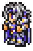
Final Fantasy Record Keeper – Mobile – 2014
The “Cosmic Paladin” costume from Record Keeper is meant to depict Cecil as he was seen in Dissidia which in turn was meant to evoke the feeling of Amano’s original concept art. Like Shibuya’s calendar piece this Cecil tries to portray his white flowing tresses, his purple and ivory palette, and the intricacies of his armour. Unfortunately it tries to be a bit too literal with some of the representation and winds up being a bit muddy. Without prior knowledge of Cecil’s Dissidia outfit there’s just not enough space in the 16×24 pixel canvas to translate the design this literally. It was ambitious though and I’m glad this little piece exists.

(G)
Pictlogica Final Fantasy – Mobile – 2013
I admit that the Pictlogica design for Cecil was not my favourite at first, but I’ve warmed up to the slightly vacant expression and less intricate colours. Despite having a similar palette it’s hard to find anything distinctly ‘Cecil’ about this sprite. The elements are there but he feels the most generic of the bunch.
Comparing the in-house styles of Pictlogica and Record Keeper is one of my favourite things when it comes to Final Fantasy sprite work. Both are mobile games that feature constantly updating rosters of Final Fantasy characters old and new, but that’s where their design similarities end. Where Record Keeper’s sprites carry on the visual elements of Final Fantasy VI, Pictlogica seems to be doing it’s own thing entirely, for better or worse. It still gives us the upstage leg for added depth but it also opts for much simpler colour palettes and bolder outlines. Lighter colours are used to give the black outlines a higher contrast than the more visually complex Record Keeper sprites. Go search for your favourite Final Fantasy protagonist from both games and you’ll see just how differently their design can be interpreted. It’s especially interesting for characters from IV and V; comparing the originals, their VI-inspired Record Keeper counterparts, and their Pictlogica versions is an interesting study.
The fact that Shibuya didn’t create a sprite based on his concept art until 2017 shows that the skill required to interpret Amano’s art into such minimal real estate is an incredibly difficult undertaking. That’s almost certainly one of the reasons that so many liberties were taken when he first appeared in 16-bits with his short purple hair and golden armour.
It can be easy to take excellent pixel art for granted when game stores are lousy with throwback merchandise and each week sees a new retro-inspired platformer. With Final Fantasy having recently celebrated it’s 30th birthday there are plenty of avenues for Square to capitalize on series nostalgia. But even taken out of context it’s easy to see what makes these designs so evergreen. It’s the limitation of resources that forces an artist to make bold choices about how visual information is presented. This isn’t a new idea to anyone familiar with pixel art, but to see how many different artists (or even the same artist over many years) can interpret a character using the same limitations is endlessly exciting. And Cecil, as the white knight that introduced RPGs to a significant audience in the west, is a perfect example of how varied these interpretations can be.
